

Eli Karon Group Brand Identity Exploration
Eli Karon, Douglas Elliman, Brand Identity, Logo Design
Eli Karon approached the marketing team with a desire to build a brand identity to reflect his growing business operations–at the time a mix of young talents–and to serve as a platform for his brand to apply to much more than a business card or yard sign.
Although the shifting economics of the real estate market changed the priorities of the client, I am proud of the concepts that were developed for the project. I believe they demonstrate a solid range of concepts derived from very broad requests.
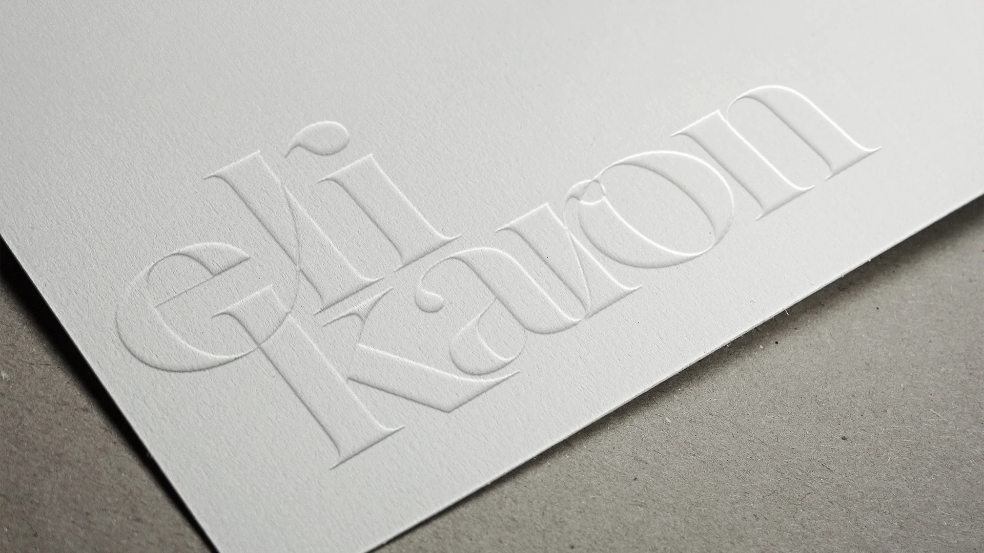
The initial request, as seen in the Round 1 design development, was for the client’s name to be the primary focus of the logo with a youthful flair. All three options presented were well received and further discussions with his team led to some broad ideas of where the logo may lead and a desire to integrate a strong identifier. Requests from the team included a desire to fit in with a trend, a design to represent real estate in Southern California, and the process of real estate itself. While the requests were broad and not well defined for focus, the designs reflected in Round 2 demonstrate different approaches to their conundrum of desire.
Round 1 of the Brand Identity design presentation for the client. The initial request of the primary agent’s name as being the sole focus of brand identity is reflected in the concepts and mockups.


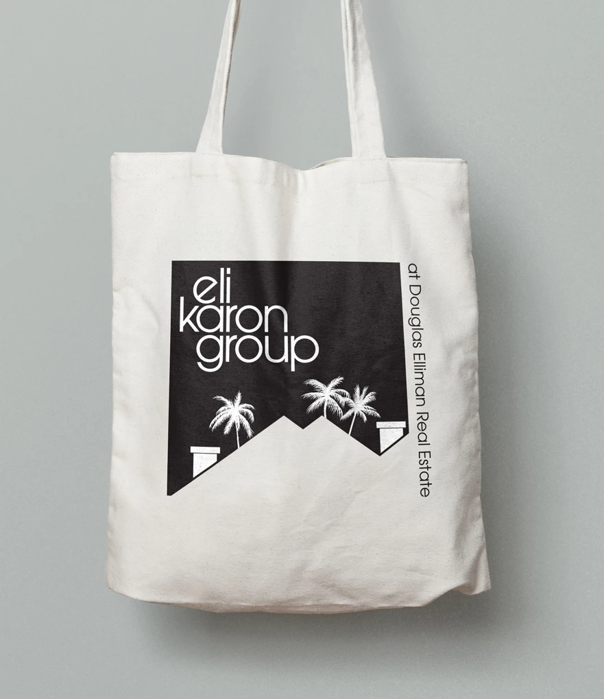
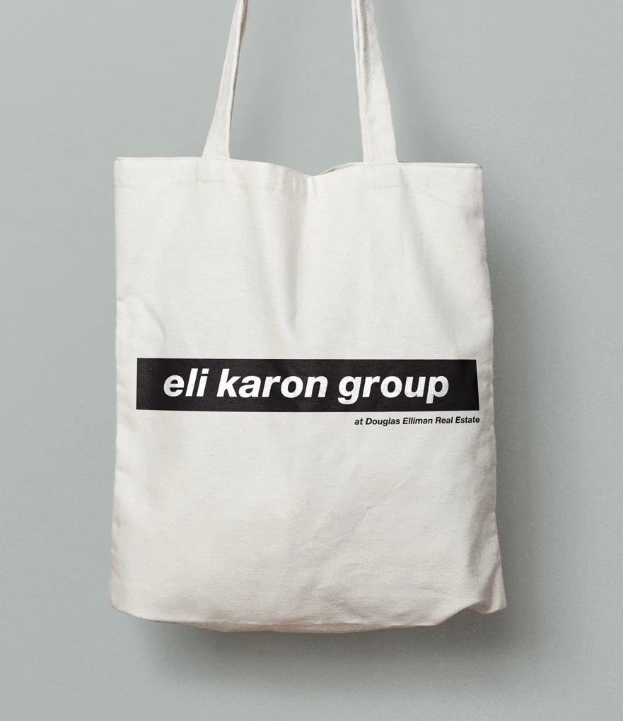
Round 2 of the Brand Identity design presentation for the client. From the first round, the client’s team envisioned a greater brand expansion to various items that may be given to clients, reflected in the mockups included in the presentation.
Option 1 features a singular icon integrating the team name, the mountainous backdrop of Southern California landscapes becoming rooftops with the ever-iconic palm tree. Option 2 fulfilled a simple request to reference, in the client’s mind, the logo for Supreme brand (which itself is a riff on the work of artist Barbara Kruger). Option 3 keeps things relatively simple with the iconic palm tree and specific typesetting which presents the team as modern and contemporary.